
This fire hydrant in Toronto probably makes more 💸 than you
Don’t want to read? Just check out the data visualization here. Note, the Google Maps integration doesn’t work anymore due to an outdated API key I don’t want to replace. You can check out the screenshots further down for a demonstration. Project link.
Overview
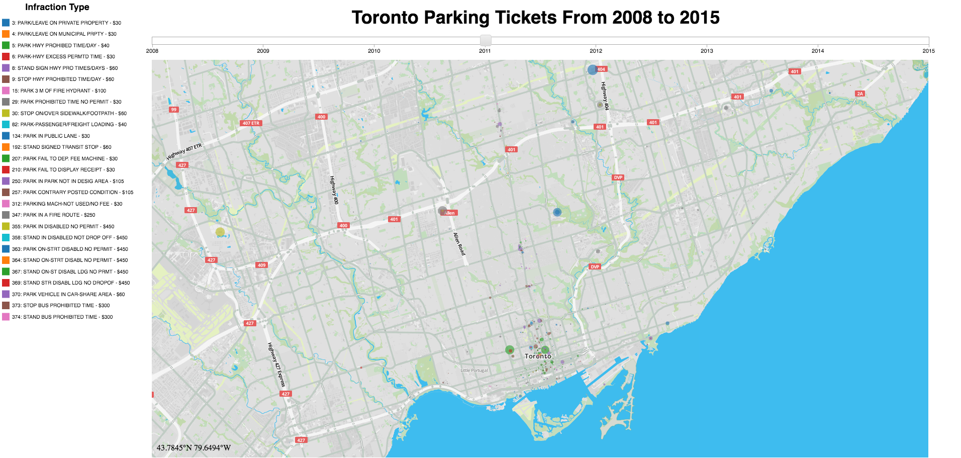
The City of Toronto has published all parking tickets issued in the last 9 years, available through their Open Data Portal. This repo houses the cleaning & analysis of this data. An interactive visualization was created to show a map-based view of the highest grossing areas in Toronto. This project was completed as part of the Udacity Data Analyst Nanodegree.
Data
The parking ticket data comes in spreadsheets, ranging from 1-4 spreadsheets per year.
The main.py loads the data from the spreadsheets into a PostgreSQL database hosted on an AWS RDS instance.
Data ETL Process
To clean and transform the data from the excel to the format required by the Postgres database, I created a FIELD_MAP parameter in config.py which defines the field name in the excel file and which function should be used to validate/transform the field.
Each field in FIELD_MAP maps to a destination column in the Postgres database (see schema). Right now the mapping is order based (i.e. the first field date maps to the first column in the tickets table and so on).
FIELD_MAP = [
    {'name':'date', 'func':'do_none'},
    {'name':'time_of_infraction', 'func':'check_int'},
    {'name':'infraction_code', 'func':'check_int'},
    {'name':'infraction_description', 'func':'check_text'},
    {'name':'set_fine_amount', 'func':'check_int'},
    {'name':'location1', 'func':'check_varchar', 'length': 10},
    {'name':'location2', 'func':'check_varchar', 'length': 50},
    {'name':'province', 'func':'check_varchar', 'length': 5}
]
The functions referenced in the FIELD_MAP are housed in the DataCleaning.py module. Using the getattr() Python function, the functions can be called from their string names.
fields = []
for field in config.FIELD_MAP:
    val = record.get(field['name'], None)
    if val:
        cleaned_val = getattr(DataCleaning, field['func'])(val=val,
                        length=field.get('length',0))
    else:
        cleaned_val = None
    fields.append(cleaned_val)
Analysis
This entire project was motivated by the work of Ben Wellington, who runs a blog called IQuantNY. Ben has done some interesting work with New York’s parking ticket data (and open data in general), documented here and here.
What intrigued me most was that he found a fire hydrant that was wreaking havoc with parking tickets, due to it’s hidden nature. As a result, I decided to try and find Toronto’s top grossing fire hydrants.
For each spot, the total fines accumulated between 2008 and 2016 are shown. Take a look at the Google streetview shots and see what you think. Some of the fire hydrants are quite far away from the curb, which seemed somewhat controversial to me at first since they would be hard to spot on a busy day. It looks like the City of Toronto has since made efforts to make the hydrants more visible.
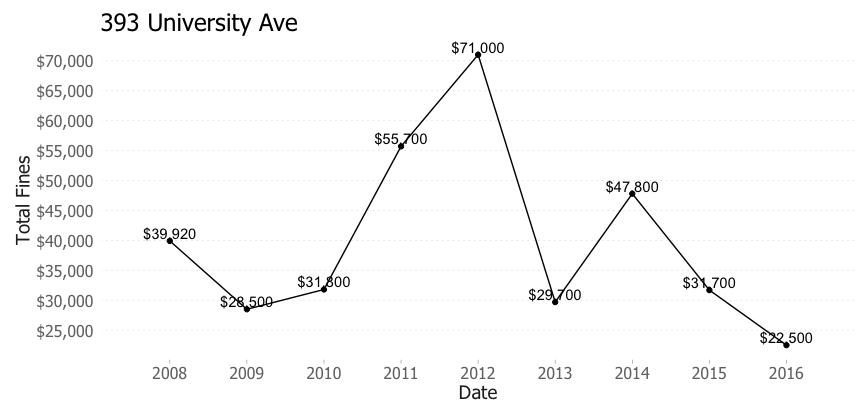
1) 393 UNIVERSITY AVE - $358,620
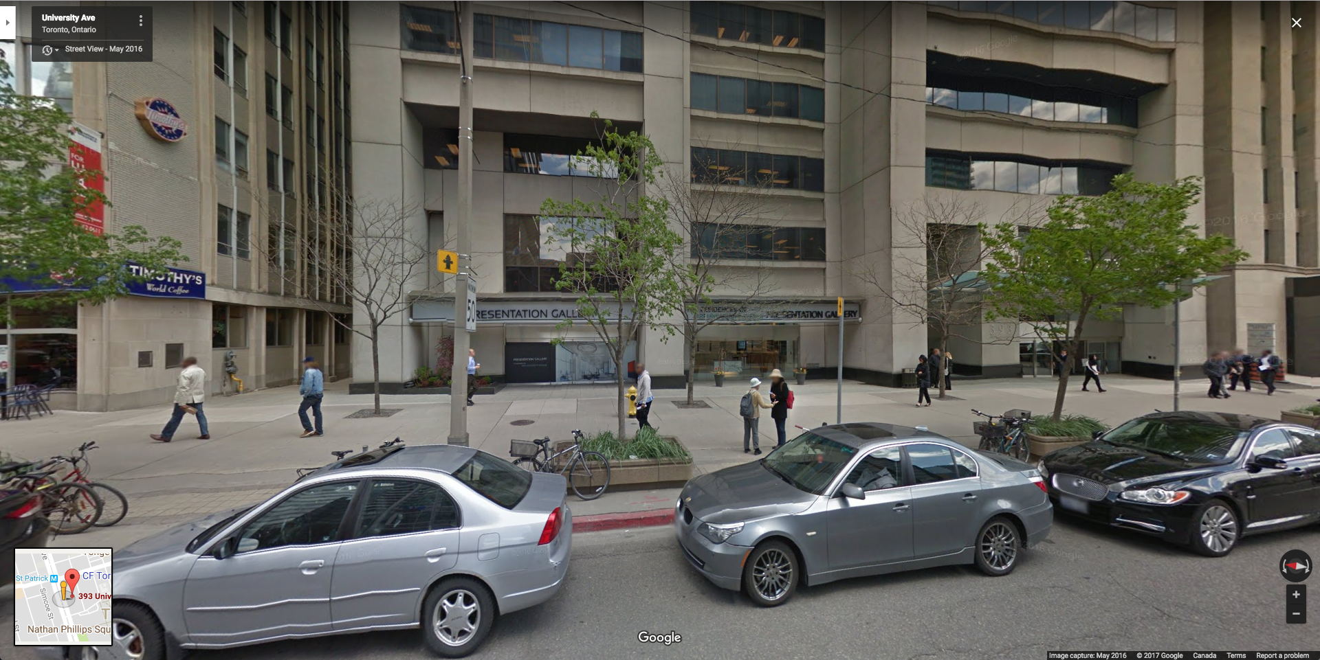
I originally looked at this data in August 2016. At this time, the curb was still painted red but there was not vertical sign indicating a fire hydrant. I’m not sure when the change was made, but it appears that the location has seen a downward trend in revenues.
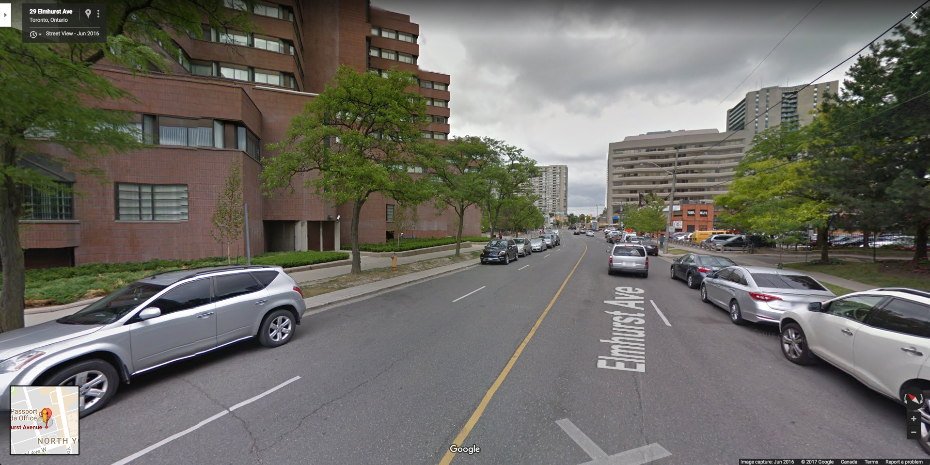
2) 33 ELMHURST AVE - $282,200
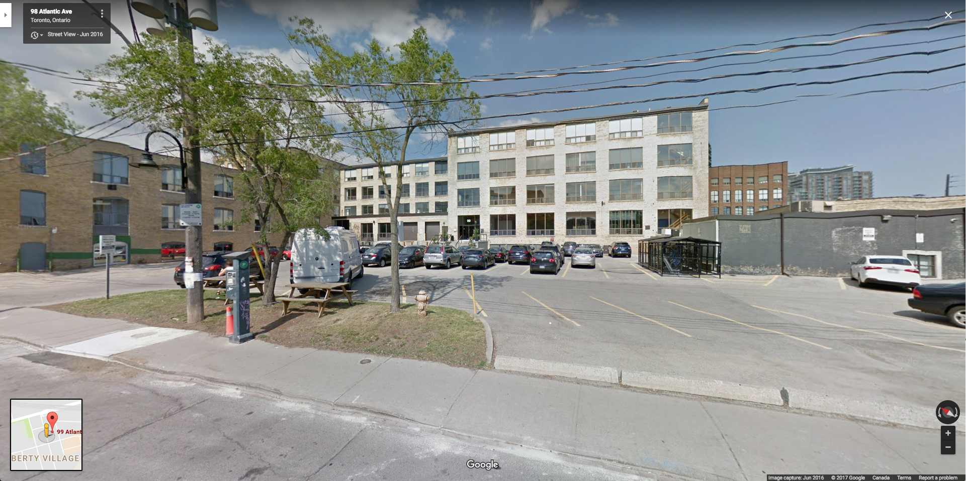
3) 99 ATLANTIC AVE - $263,060
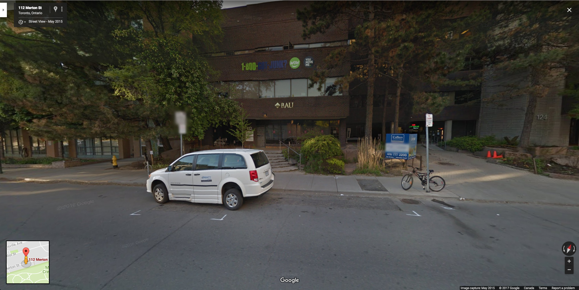
4) 112 MERTON ST - $254,340
5) 56 THE ESPLANADE - $231,980
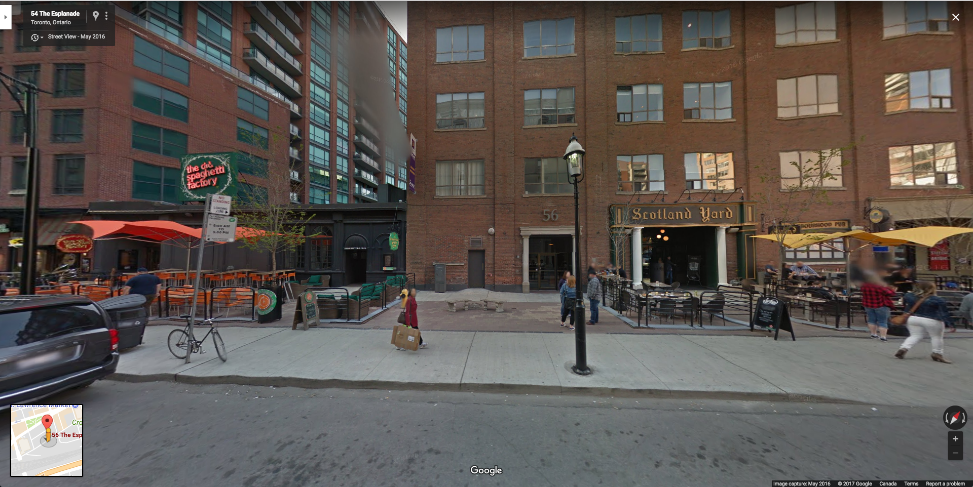
This one is so far back from the curb…
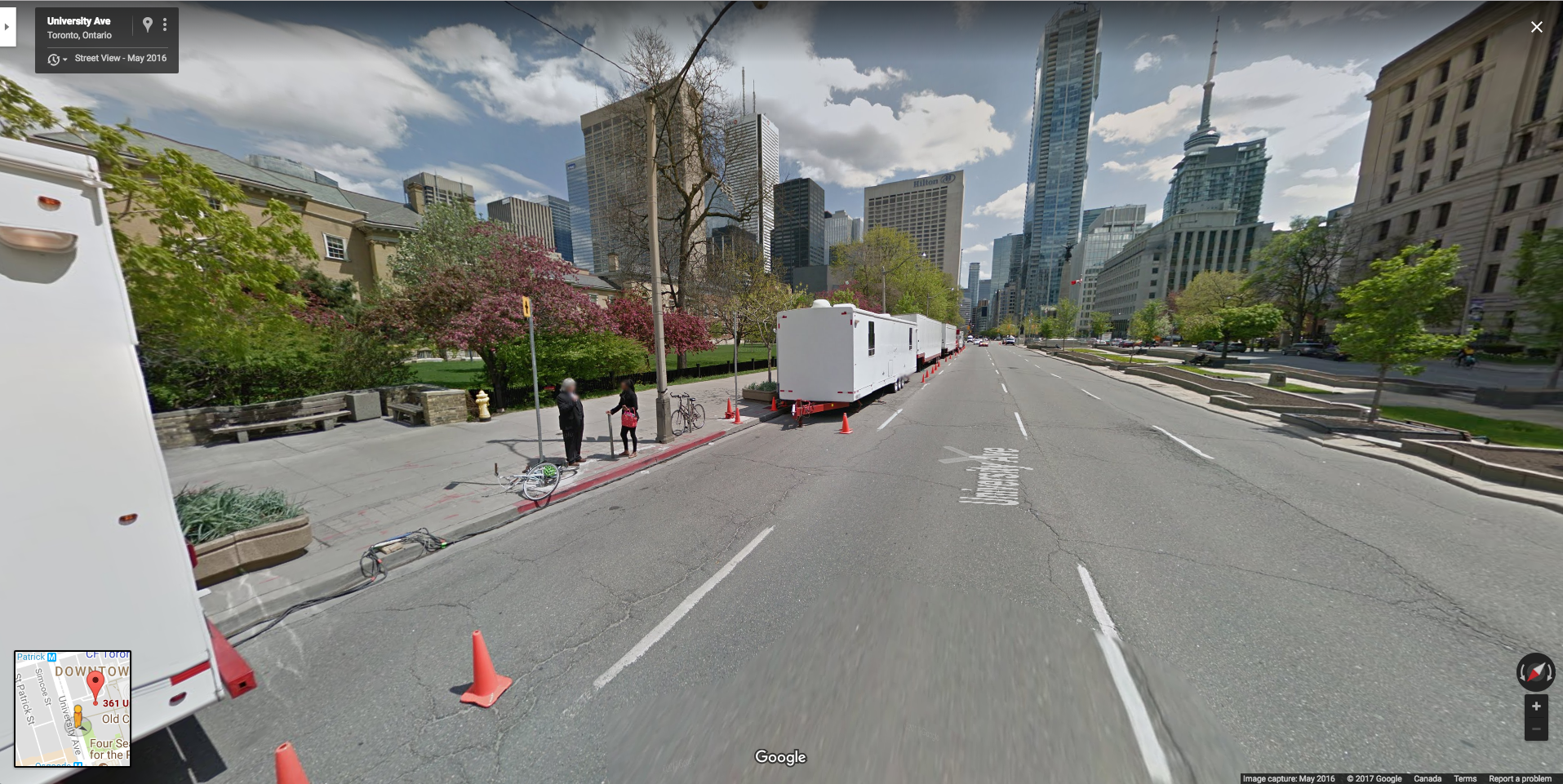
6) 361 UNIVERSITY AVE - $203,730
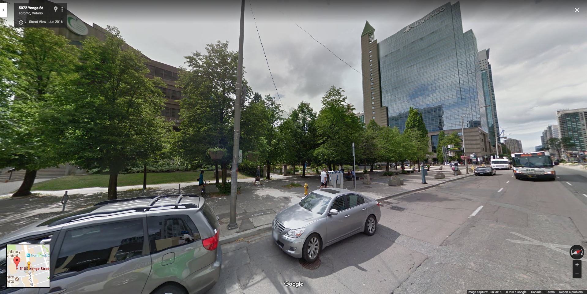
7) 5100 YONGE ST - $175,150
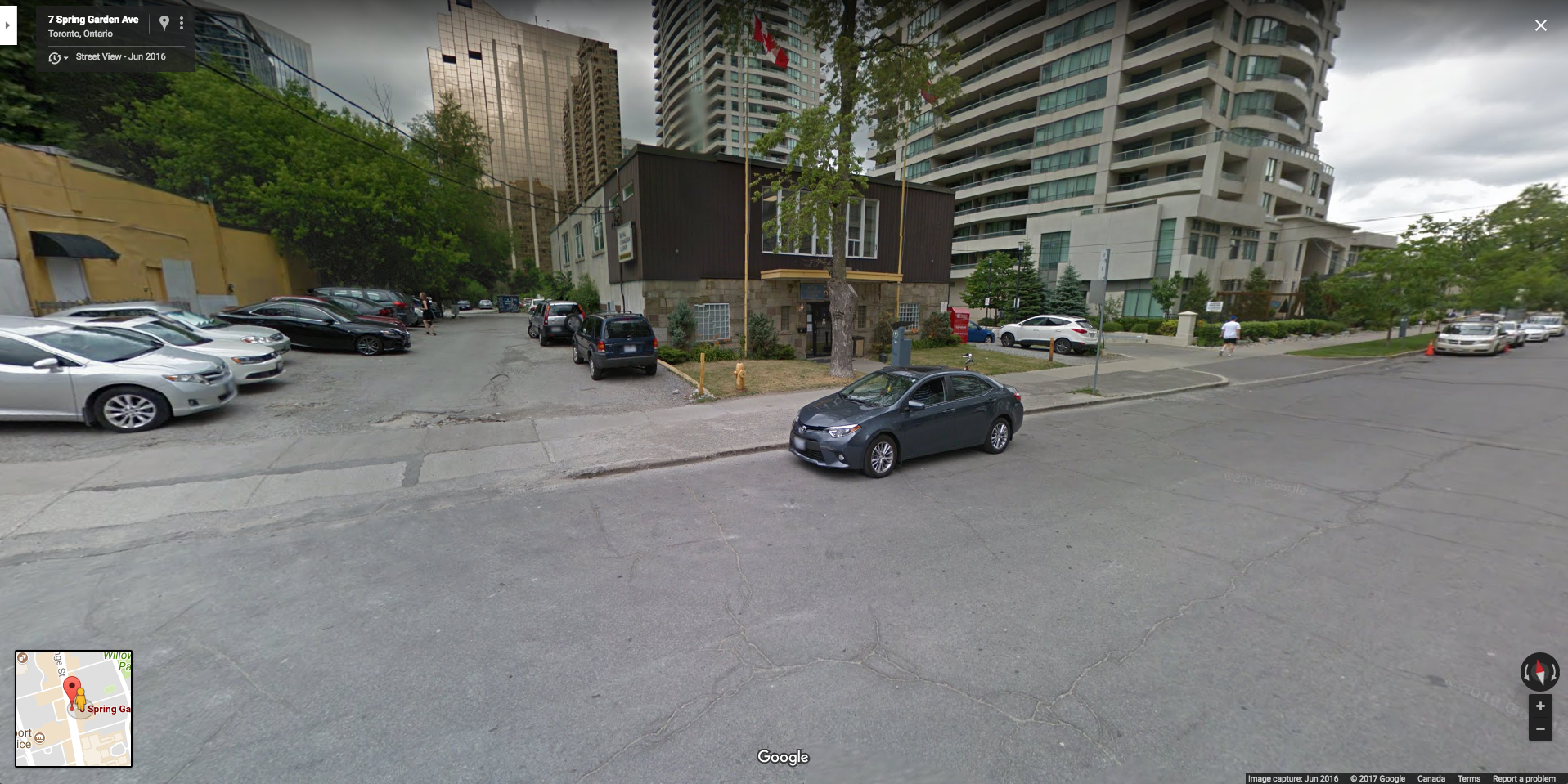
8) 6 SPRING GARDEN AVE - $162,810
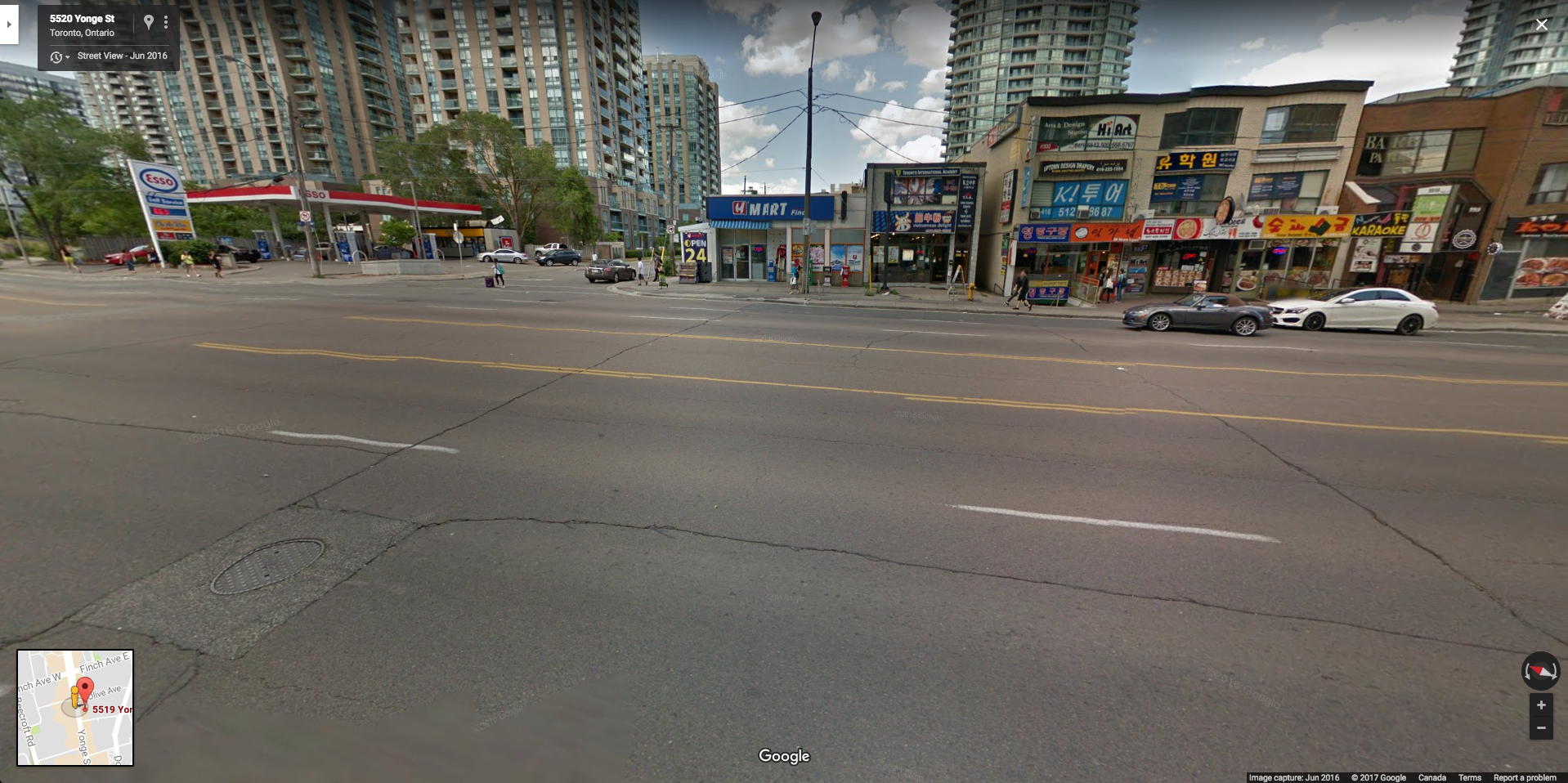
9) 5519 YONGE ST - $160,030
10) 43 ELM ST - $159,790
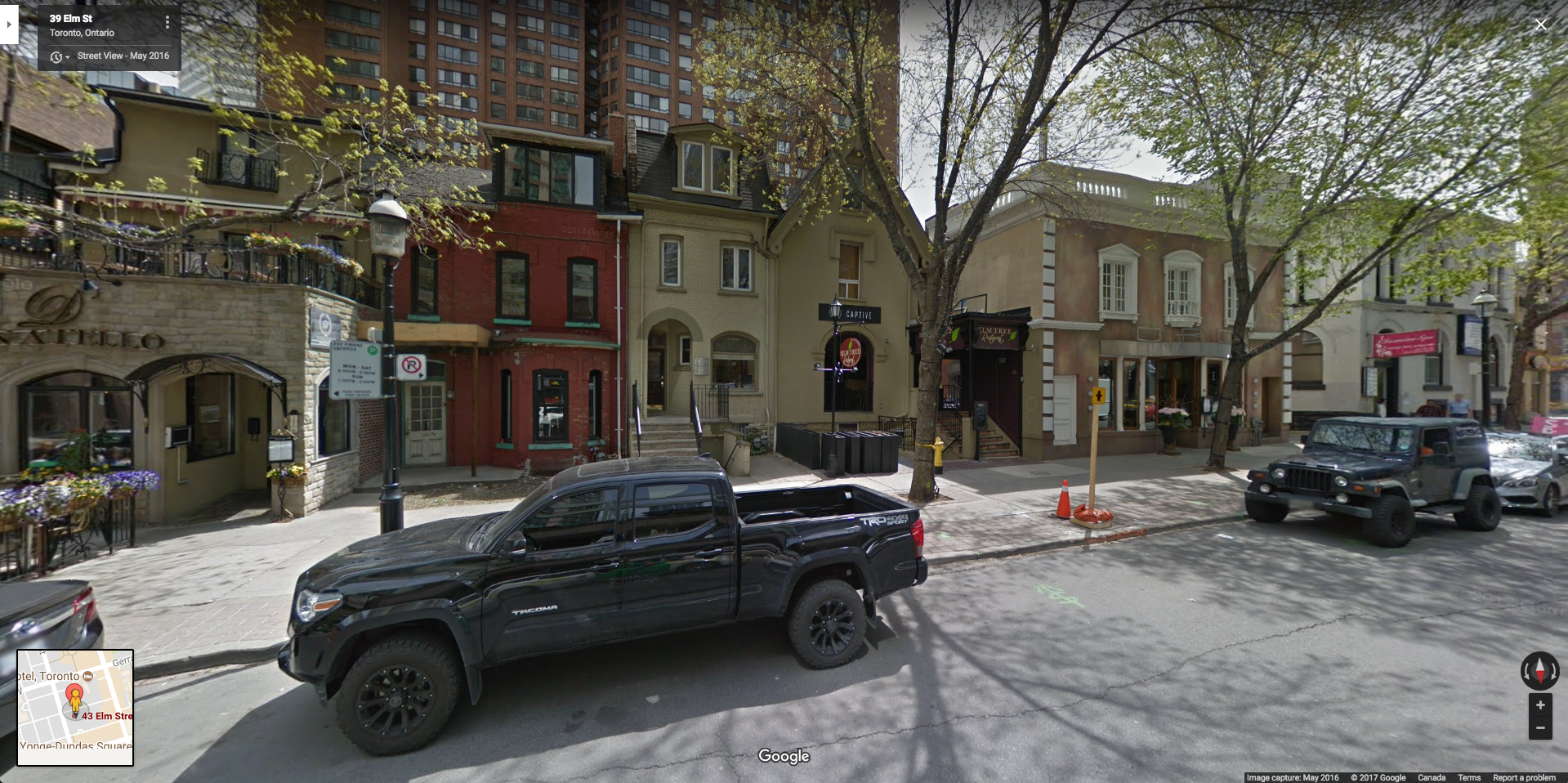
Thankfully they put a sign by this one.
Visualization
Design Overview
Rather than producing a series of line charts, I wanted to give users the ability to explore the top grossing parking spots in Toronto. In my mind, one of the most important attributes of a parking ticket is location. As a result, I chose to create a map-based visualization with other attributes, such as total fines and infraction type, coded by size and colour respectively.
I chose to encode the parking spot’s revenue with the circle’s size. Big circles immediately pop out to viewers, which is what the visualization is intended to do. User’s can quickly identify the top grossing spots without much effort. This was accomplished using a linear radius scale, where I mapped the square root of the total revenue to the radius value. This ensures that a location with 2x the revenue of another has a circle area that is 2x as well. The minimum and maximum circle sizes were chosen such that the largest circles didn’t impede the viewing of other circles, while the smallest circles were still large enough to be identified on the map.
Users should be able to immediately see that the bulk of the top grossing locations are in downtown Toronto, as one might expect. On top of seeing trends by area, users can quickly find the highest grossing spots and ticket types based on the size and colour of each circle.
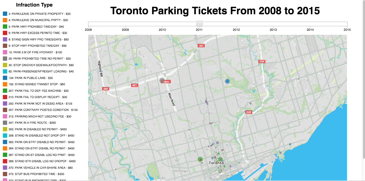
Initial Design
A screenshot of the initial design is shown below:
Feedback
I was lucky enough to receive feedback from 3 different people, who all offered similar viewpoints.
One of the main complaints was that the map background made it difficult to spot the parking spots and differentiate between the different colours. Additionally, the legend was cut off for some users with smaller screens (see screenshot below from a 13” Macbook). This was my first experience building a web-based visualization, which introduced me to the importance of designing for different devices!
The other main piece of feedback I received was around usability. All 3 people wanted more options to explore the data.
Final Design
After incorporating all the feedback I received, I came up with the final design shown below.
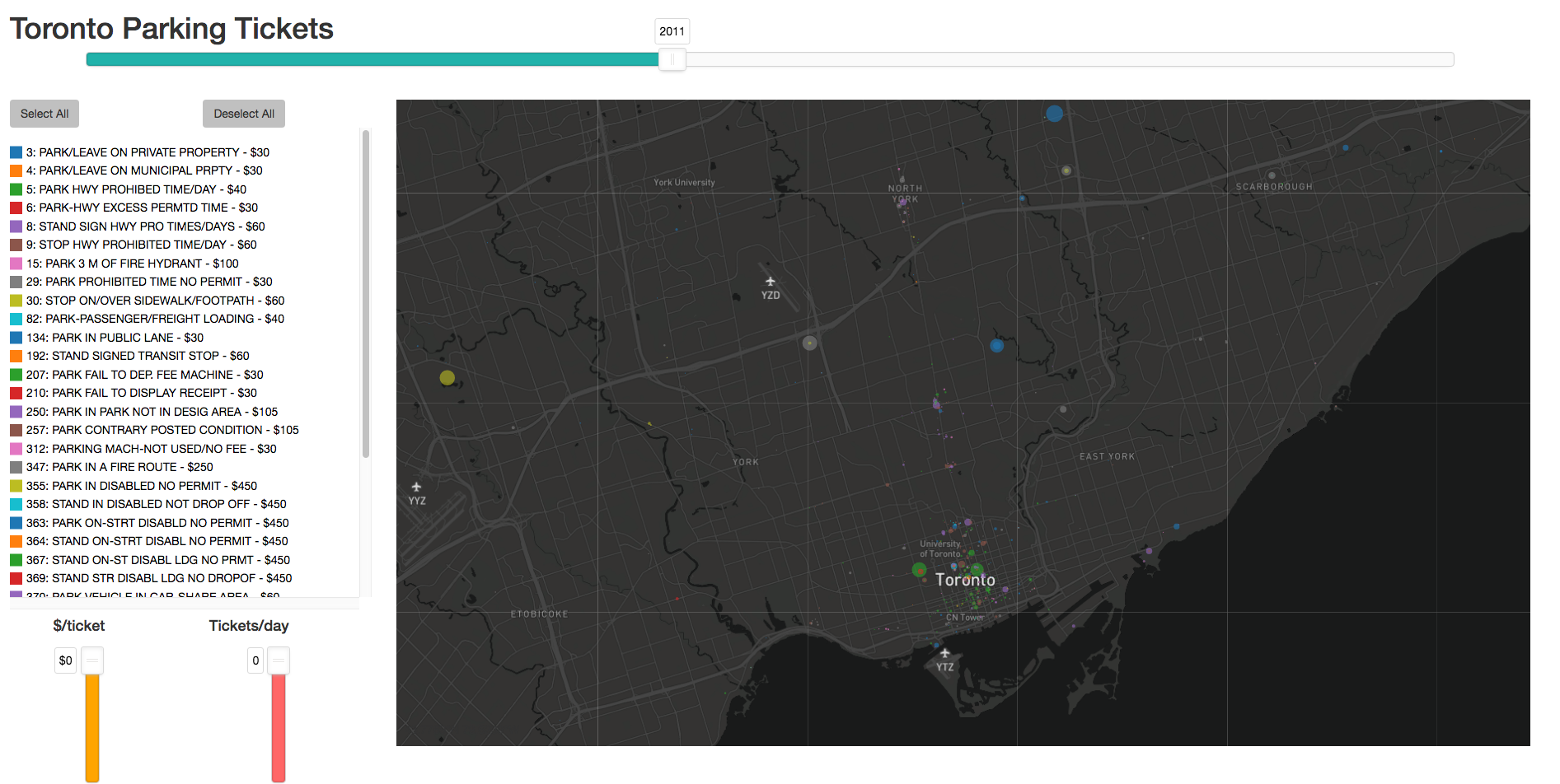
Several key changes were implemented:
1) Using a Mapbox Map Theme
The final design incorporates a dark grey/black map background, which allows the circles to be easily spotted and differentiated.
2) Bootstrap to the rescue!
To deal with different screen sizes, I implemented bootstrap’s wonderful grid system, which automatically resizes the HTML elements across screens.
The legend, which was previously too long for certain screens, is now contained in a scrollable container.
3) More opportunities to explore
The original design only allowed users to switch between years and see how the top spot’s revenues changed over time. To allow for more interactivity and exploration, I added two new sliders. The first slider allows users to filter spots by ticket amount. The second spot filters the spots by ticket frequency. These two sliders allow people to differentiate between spots that give low-frequency, high amount tickets (parking in disabled spots) and the high frequency, low amount infractions (parking on private property).
I also decided to make the legend interactive, by allowing each infraction type to be toggled on and off with a click. This allows users to compare locations by a certain infraction type. For example, comparing the highest grossing fire hydrants across the city.
The last feature, and the one I am most excited about, is the ability to see the streetview associated with a given spot. After clicking on a circle, the google maps streetview will appear in a pop-up window:
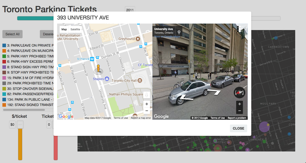
When I first sent the revised design back to the initial reviewers, half of them didn’t know this feature existed. As a result, the final change I made was to add some instructions that pop-up when people first come to the site!
Resources
The visualization was created using D3.js. The following resources were used to create the visualization:
2) D3 Tips